Hands On Samsung’s New NotePRO Tablet: Like Surface for Android
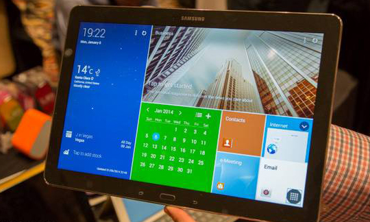
We just got to feel up Samsung’s latest tablet offering in the 12.2-inch beast of the Galaxy NotePRO. Here’s what we thought.
For starters that screen really woos your eyeballs. It’s big and beautiful. It’s plenty bright, colors really pop, and it’s super sharp. Text looked great, photos looked great. The screen: Great.
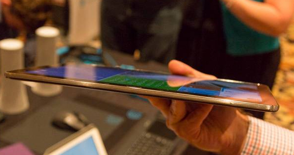
The cost of that screen size, though, is portability. It’s about as light and thin as it could be, but there’s not a jacket pocket in the world it would fit into. Holding it one handed, was definitely a bit of a task, and I’d be afraid of carrying on a crowded subway for fear of dropping it.
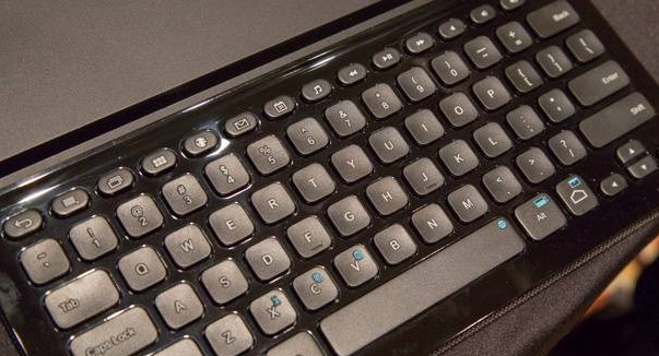
Go got to try it with Logitech’s keyboard case ($130), and while it’s significantly thicker than Microsoft Surface, it was an absolute joy to type on. I mean it was almost indistinguishable from a good laptop keyboard. The keyboard includes all the Android-specific shortcut buttons you could want, including home, menu, back, and multi-tasking. Using the keyboard to flip around the screens was extremely intuitive.
 .
.
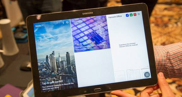
As we feared, it seems that Samsung’s MagazineUX slows things down a bit. It’s a very heavy skin and it’s going to take some processing power to keep all of those tasks going simultaneously. That said, it was still really fast. Apps pop open very quickly, and even dividing the screen into four different apps worked very well. There’s just not that buttery smoothness when you’re scrolling around that you’d hope for.
Overall, we were pretty impressed. This is definitely a business-focused tablet, though, and you’ve got to really want that size. Pricing-which still hasn’t been announced-will play a huge role in how big this thing gets, but in a nut-shell, at first glance, we like it.

Leave a Reply